7.30.2009

102 degrees

The average temp in Portland this week has things . . . wilting.

Even my candles couldn't handle it when it hit 107 degrees yesterday.

7.26.2009

inspired

I love getting catalogs in the mail. I love flipping through them, admiring the styling and *borrowing* ideas for my own house.

I was particularly inspired by the Pottery Barn catalog tonight. There are a few amazing decorating ideas that I wanted to share.

LOVE the pictures above the bed. Love casual arrangement and how they are *clipped* to the twine.


I'll take this whole office. But I'm particularly swooning over the cubby wall organizer. Especially the way they display pictures and mason jars filled with goodies.


I'm trying to find ways to bring the outdoors in, and I love the branch above this bed. So rustic and delightful.


I love the *found* object above the couch. I *found* an object at a garage sale recently that is very similar to this. I'm so excited to get it hung and show you all! Nothing is more exciting than taking a chance on a random purchase, only to have it *justified* by PB.


*photos via Pottery Barn*

7.20.2009

inspired

Oh how I love this bedroom.


I have this bedding. And once I saw the bedding I knew there would be no other bedding for me. Beyond that, our bedroom is b.o.r.i.n.g. I've been trying to decide what color to paint, and how to mix up the bedding so it doesn't look so much like a set. The above bed is just beautiful. Oh, and the wallpaper is completely amazing as well.

*photo via Apartment Therapy*

7.16.2009

stripey!

As we showed you earlier this week, our house's facade received a face lift last weekend.

But, we weren't done there. In our quest to liven up our adorable bungalow, and add curb appeal to boot, we busted out the paint cans. Again.

First, the door became a lovely shade of red. It's deep and moody and compliments the yellow house perfectly.


Next, we added:

Stripes!

It started out of necessity. After only a week of having the steps and landing painted dark, it was filthy. As in, driving me crazy to the point of hosing it down daily crazy. Not good. So, we decided to paint the treads a lighter grey to hide the dirt.

I love painted stripes and have been dying to incorporate them somewhere. This was the perfect spot.

Cheery, right? It livens ups the porch and adds tons of character to our lovely little bungalow. We couldn't be happier. And now me and paint are taking a break. We've been spending too much quality time together lately.

7.12.2009

a facelift

There's no better time than summer for updating a home's facade. Especially in Oregon where it rains 98% of the rest year. Constantly. Summer hit us a little earlier this year, as evidenced by my crazy garden. So we've jumped anxiously into our *summer* home updates: painting the house foundation.

We finished painting the house last summer, and just love it. But our foundation was dragging down the nice paint job and the house. As a reminder, here's the before:

The light blue-gray foundation did nothing to compliment the house color. And, it was peeling. Under the gray was red. Oy.

We started with powerwashing the house foundation. Meeessssyy. Lots of old paint - red and blue - come off in the process.

Next we set about choosing a color. We knew we wanted to go darker. Darker grounds the house and looks more polished. First attempt:

*Note: please ignore the yellow grass. We aren't so good with yards yet.* We thought choosing the darkest shade of the house color would be nice. It would have the same tone, while grounding the house. As you can see this color was. Not. Good. I learned a very valuable paint lesson. Color appears much lighter in light spaces than on a color chip. Shades and shades lighter. Ick.

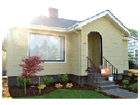
Back to the paint store we went. We came home with three colors to try. This is the color we chose:

So much better. Dark gray. It compliments the roof and the house trim. We are so happy with it. There's actually more to this project. Stay tuned to see how we jazzed up the entry way a bit and quickly added *curb appeal.*

7.07.2009

inspired

Confession: I have mild obsession for all things Kate Spade. The items of hers that I own, I love. And some I've had for many years. Classic, spunky and fun, all her products have me swooning. Luckily for my budget and my husband, there isn't a Kate store in Portland.

When I ran across photos from her home a while back, I was smitten.

Love frame collages. The moody grey walls. And, the green wallpaper in the bathroom. OMG.


Love how the burst of orange really livens up the classic dining room.


I want to plop myself down in the striped chair and read for hours. I'll take the yellow chair in the background. And, the blue/grey drapes in the next room while we're at it.


There are no words. This kitchen is fabulous.

*photos via The State of Things*

7.06.2009

first harvest

We have veggies! Here's our first harvest: walla walla sweet onion (omg. yum.) and a zucchini. And now a word of warning for all the other garden illiterate people in this world. This plant, with its enormous leaves and big yellow flowers, is not a cucumber plant. Even if it is marked burpless cucumbers at the store. And that is your favorite cucumber ever. Even if you dutifully kept the marker tag so you can identify it. Even with all that, it will not produce cucumbers. No. It will only produce really large and odd shaped zucchini. Lesson learned.

7.03.2009

where the wildlife lives

We woke to this little guy yesterday morning. We think he might have confused the leaves and branch for his home. His bright orange home.

7.02.2009

on a hot day

95 degrees and blazing sun. Serve and enjoy.