Happy Friday friends!
After looking through my clipping files this week, I pulled together a palette of colors I'd like to see consistently through our house. Our house, really, is pretty tiny. I'm becoming increasingly aware of how straying from a palette can really break rooms up and make them feel disjointed.
So, I've pulled together a solid range of neutrals, with some fun pops of color to add a little dimension to each space.
Honestly, I get a little freaked at the thought of bright colors. But I love how other houses look when they're used - correctly - and want to take some risks moving forward. I'll keep a neutral base of blues (yep, that's working out to be a great neutral for me), browns and greys. And as pops of color, I'd like to add in some yellows, red-oranges and oranges. I love these three colors. They just make me smile. I would also like to play around with a darker blue/turquoise color. I think it'll add a little depth to the light blue neutral.
A couple recent additions to our home that both highlight and confirm my palette are this adorable tea towel ...
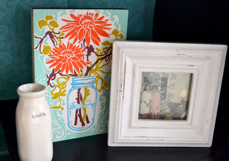
... And this new letterpress.
Both have the bright pops of color I'm looking for ... and are just so cute! I like having a color palette nailed down. We have a couple rooms we're looking at sprucing up this year and this will make my life so much easier.
What are your favorite colors lately? Do you lean toward the amazing jewel tones out this season? Do you prefer to stay in neutral territory?
Have a great weekend!
Update: I'm linking up to Samantha's Fab Friend Friday. It's a clever way to meet new bloggers. Hop on over and say hi! :)
Update: I'm linking up to Samantha's Fab Friend Friday. It's a clever way to meet new bloggers. Hop on over and say hi! :)


Where is the letterpress from? I'm obsessed! I love these colors!!!!!
ReplyDeletexoxo
Jenn @ Peas & Crayons
I know, right! I LOVE it. It's from Old School Stationers: www.oldschoolstationers.com
ReplyDeleteI love that letterpress!
ReplyDeletefab palette jenn! once again your organized ways inspire me. that cupycake tea towel is adorable. i love neutrals with blasts of brights. tending to lean toward crayola primaries with a vintage feel myself. happy sunday beautiful! ♥
ReplyDeleteI love these colors, I'm excited to see how it all comes together for you!
ReplyDeleteI LOVE these colors! Your house is so beautiful!
ReplyDeleteI gave you a little shout out/award on my blog today. Check it out :)
youseriouslymadethat.blogspot.com
Cami
I am so obsessed with letterpress! Love that! Great choice. :)
ReplyDeleteHi Jenn!!!!!
ReplyDeleteI really love the letterpress and also love your color palette
xoxo
like the blog!
ReplyDeletefeel free to visit mine =)
http://jenniferscavone.blogspot.com
Ciao bella!
the yellow is beautiful! it's killin me! I love it.
ReplyDeleteso pretty, jenn.
I am looking forward to seeing your home transformation!
Small world! When I went to Crafty Wonderland my friend bought the same artwork...and I was lusting after the 'Green Bean' print.
ReplyDeleteLeigha
Love this combo of colors, bright and cheery without feeling overwhelming.
ReplyDeleteHey Jenn! I've been meaning to comment on this post for a long time! I LOVE your idea of coming up with a color palette for your whole house like that. It's such a great way to see what your house looks like all in one place and to make tweaks here and there that really make it a place you love to be. Loving the towel and art too!
ReplyDeleteNext time I get a free minute, you'd better believe I'm going to be trying to figure out what OUR color palette is supposed to be. Wish me luck! :)