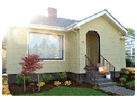
Happy Monday friends! Did you all have a great weekend? It was our first weekend at home in quite a few weeks, so I took the opportunity to get some painting done: back porch, house trim, garage, frames. By late yesterday afternoon my pinky finger was cramping around the paint brush, but I got SO MUCH DONE! :) This time of year I start get panicked about how much time I'll have left to get *outdoor* projects done before the weather turns crummy. It's like a mad dash before the rains start for the rest of the fall/winter!
But enough about painting. We have plenty of time to talk about that later. Today, let's talk about inspiration in the form of the Commodore Hotel. Last week I mentioned the Commodore when I shared our recent trip to Astoria with you. We stayed there, and I'm so in love with design, so I thought we'd kick the week off with a quick tour.
The original hotel closed in 1965. The building was purchased in 2007 and restored with both attention to historic detail and a wonderfully updated, contemporary feel. The outside showcases the beautiful historic building. I love the two rocking chairs out front. It was such a cozy place to relax for a few minutes.
The hotel is connected to a cafe, and this is the view from the cafe into the lobby. LOVE the dark walls and the lobby font.
Friends, the lobby is amazing. It isn't big by any stretch, but it's full of quirky, fun, inviting decor. There's plenty of places to sit, a nice fireplace and a great bookcase.
Let's take a closer look at that incredible bookcase. SO MUCH TEXTURE. There are so many gorgeous books, and I love that they have them facing both ways. Pair that with great antiques and the ends of rolled up paper, this bookcase is an amazing focal point for the lobby.
The rooms are by no means fancy, but they were so comfortable. Usually I shy away from wood windows, but I LOVE the dark wood on these. It makes them a very appropriate feature in the room, especially paired with the mostly-white/light colored furnishings. Oh and that orange coffee table? You better believe that MADE the room for me :). It's a great pop of color.
The all white bed was so crisp and clean and inviting. Oh, and it was comfortable too :).
The bathrooms are super white with lots of great white tile and white and gray granite. I love this look in a bathroom. Especially a hotel bathroom. It feels so luxorious.
Orange door with a fire escape info painted on the window? YES.
Hallway light. Gorgeous detail.
The interior was designed by Andee Hess' Portland interior design company Osmose. She is the genius behind this gorgeous kitchen:
Photos via me, Commodore Hotel, Remodelista and Dwell.
What do you think of the hotel? And, what's a great hotel that you stayed in recently? Or what's a hotel that you dream of staying in someday? We'd all love to hear! :)


Oh, I love-love-love that funky bookcase! I wonder if I can convince Ryan that we should DIY that. . . :)
ReplyDeleteLove it, if I'm ever in Astoria, I know where to stay!
ReplyDeleteI love exploring new hotels too!!
ReplyDeleteSuch an urban one! Cute photos!
♥
Pearl
What a fun place to stay. And I agree that Lobby sign is great!
ReplyDelete