
I have to admit, a part of me actually enjoys that stores start stocking their spring lines right about now. I know some of you are still buried under snow/ice, and even if you aren't, it isn't exactly spring out there. But I'm tired of winter and spring catalogs are a nice reminder that this much anticipated season will arrive. Someday. :) My spring catalogs have been pouring in the past couple weeks, and I finally had the chance to sit down with them this weekend.
If you look into my closet right now, you'll find a wardrobe full of single-color garments. I very rarely bust out a pattern or multi-hued look. So, I was a little surprised by how much I like the spring florals this year! I was drawn to the interesting palettes that mixed bright pops of spring color with neutrals. Kinda how we aim to decorate, right? So I paired a few of my favorite pieces with great rooms to give you an idea of how you can pull fun spring palettes into your both look and your home! I think we all need a pop of color this time of year.
Palette #1. Yellow is pretty much my go-to *pop* color, and I really love how it subtly adds a fun touch to this dress.


Palette #2: These fun, bright colors are really grounded by the deep olive green that serves as a neutral here.


Palette #3: This teal/green color is so fun and fresh! I love it paired with yellow (of course), but I can also see it going great with pinks and reds.


I'll definitely be branching out this spring. What is YOUR favorite color palette right now?


Beautiful photos! I really like how you tied together fashion and home design :)
ReplyDeleteMy go to palette right now is probably pretty close to the top one (with the mustard yellow). I dyed my hair a dark auburn color this weekend and love how these colors look against my skin!
I
ReplyDeleteLOVE
THESE!!!!!!!
I tend to go for teal-y colors and lots of yellow accents in the spring. But it's me, so theres a pop of every color ever along with it =)
xoxo
Jenn @ Peas & Crayons
My go to color to pop is red. What does that say about me? Wait. Don't answer that.
ReplyDeleteP.S. LOVE that skirt from anthro
The teal headboard is awesome. I love all of them tho.
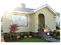
ReplyDeleteCool pics- I love this post! How we dress ourselves and our home are both expressions of ourselves. I love the pic of the porch! I tend to jump all around in clothing colors but usually like softer colors in my home.
ReplyDeleteLove that dress!SOOO pretty!
ReplyDeleteI love palette #3, such wonderful colors!
ReplyDeleteyou are the sweetest thing! <3 thank you for your note; i actually just had an inspiration fire lit under my butt today and will be back with a vengeance! :) and inspired by color too! great minds think alike... i looooove your color picks! see you soon! xo
ReplyDeleteThe colors in the J.Crew scarf are so pretty, need to add this to my large color inspiration folder. The olive is so pretty. Always love to see other color palettes as I am a bit obsessed with them :)
ReplyDeleteI, too, am stuck on mustard yellow. It's my go to, too. And the skirt from Anthropologie is delicious.
ReplyDeleteLeigha
I am loving these colors!! That porch is to die for...seriously, I love it!
ReplyDelete